Why We Stopped Opening Pitches With Mood Boards
Mood boards answer a question nobody asked yet
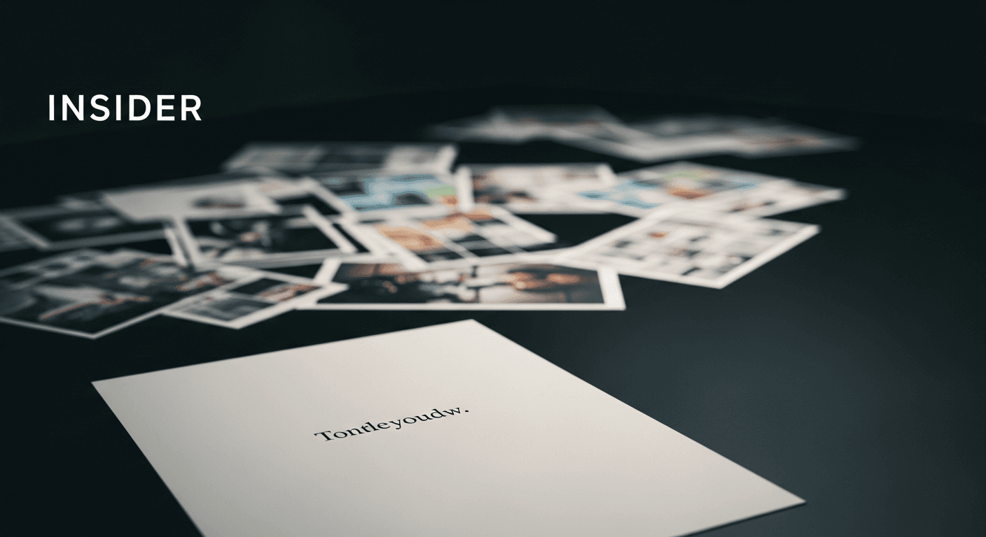
For years, our first deliverable in any pitch was a board of inspiration images — collected textures, fonts, color swatches, "vibes." It felt thorough. It also, we slowly realized, skipped the only question that actually mattered: what is this brand trying to make someone feel, and why should they believe it?
A pretty board can make a room nod along without anyone agreeing on anything real. That's a dangerous kind of agreement — it dissolves the moment actual design decisions have to get made.
Starting with a sentence instead of a swatch
Now we open with one sentence: a plain description of how someone should feel three seconds after encountering the brand. Confident but unshowy. Warm but not soft. Sharp but not cold. Everything that follows — color, type, imagery — has to answer to that sentence, not the other way around.
It's a smaller, less impressive-looking opening move. It's also the only version of "alignment" that survives contact with the actual work.
What changed once we made the switch
Revisions dropped. Arguments about "I just don't like this blue" turned into productive conversations about whether the blue served the sentence we'd agreed on. And clients started defending decisions internally using our language instead of their gut — which is the clearest sign a brand direction has actually landed.
More from the journal
Insight
Designing Brand Systems That Survive Contact With Reality
Why most brand guidelines gather dust Every agency has shipped a beautiful 80-page brand guideline that was opened twice and never touched again. The problem usually isn't the design work — it's that ...
Case Study
What Clients Mean When They Say "Make It Pop"
The phrase that makes every designer's stomach drop "Can you make it pop?" might be the most-dreaded sentence in client feedback — vague enough to mean almost anything, specific enough to feel like a ...