
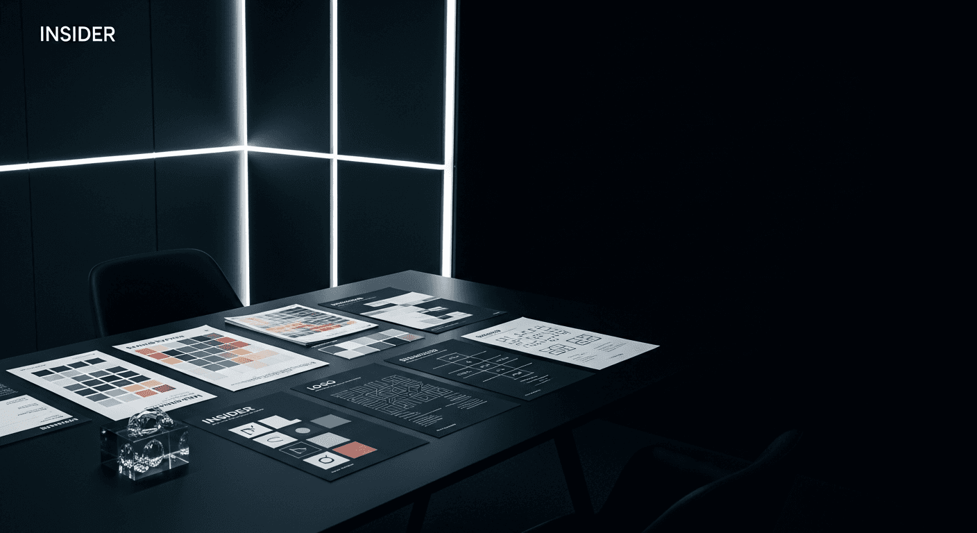
What Makes a Logo Actually Hold Up in 2026
Most logos aren't tested against the places they'll actually live
A mark looks great centered on a white slide in a pitch deck. It looks very different shrunk to 24 pixels in a browser tab, stitched onto a hoodie, or rendered in a single color on a faxed invoice nobody thought to update. The gap between "looks good in the presentation" and "works everywhere it has to work" is where most identities quietly fail.
We've started designing marks the way engineers design systems: stress-test first, admire later. If it survives the worst-case placement, the best-case placement takes care of itself.
Simplicity isn't a style choice — it's a survival trait
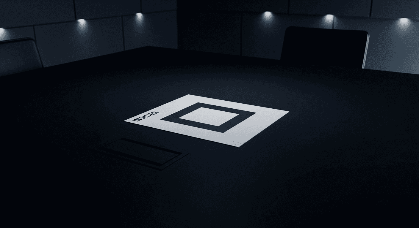
The marks that have aged well over the last decade share one trait: they give up almost nothing when reduced to a silhouette. That's not because intricate logos are wrong, it's because intricacy is fragile. Every additional flourish is one more thing that can break at small sizes, in motion, or in someone else's hands.
A logo that still reads as itself in monochrome, in motion, and in miniature has done the one job a logo actually has: being recognizable when you're not in the room to explain it.
The real test happens after the unveiling
The presentation is the easy part. The real test is what happens six months later, when an intern has to drop the mark into a slide deck, a partner needs it on a co-branded banner, and a print shop needs a version that survives being shrunk to the size of a button. A logo that still looks intentional in all of those moments is one that was actually designed — not just drawn.
More from the journal
Insight
Designing Brand Systems That Survive Contact With Reality
Why most brand guidelines gather dust Every agency has shipped a beautiful 80-page brand guideline that was opened twice and never touched again. The problem usually isn't the design work — it's that ...
Case Study
What Clients Mean When They Say "Make It Pop"
The phrase that makes every designer's stomach drop "Can you make it pop?" might be the most-dreaded sentence in client feedback — vague enough to mean almost anything, specific enough to feel like a ...