Designing for the Scroll: What Changed When Attention Got Shorter
The hero section isn't the first impression anymore
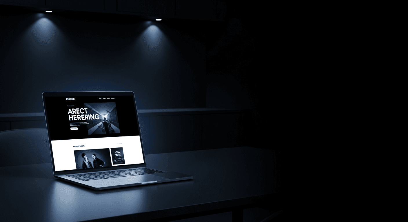
For years, web design treated the hero banner as the moment that mattered most — the thing visitors would supposedly linger on before scrolling further. That assumption doesn't hold anymore. Most visitors arrive already mid-scroll, skimming, deciding in fragments of a second whether to keep going. The "first impression" now happens across the first three or four scroll-stops, not in a single static frame.
Designing in rhythm, not in screens
That shift changes what good layout work looks like. Instead of designing isolated screens that each need to "perform," we design a rhythm — a sequence of moments that each earn the next scroll, building toward the action the page actually exists to drive. Pacing becomes as important as any individual visual.
It's less like designing a poster and more like editing a piece of music: the transitions matter as much as the parts.
The payoff is patience, not speed
Counterintuitively, designing for shorter attention spans doesn't mean cramming more into less space. It means being more deliberate about what earns a place in that sequence — and confident enough to leave the rest out. Pages built this way don't just look calmer. They convert better, because every scroll has a reason to continue.
More from the journal
Insight
Designing Brand Systems That Survive Contact With Reality
Why most brand guidelines gather dust Every agency has shipped a beautiful 80-page brand guideline that was opened twice and never touched again. The problem usually isn't the design work — it's that ...
Case Study
What Clients Mean When They Say "Make It Pop"
The phrase that makes every designer's stomach drop "Can you make it pop?" might be the most-dreaded sentence in client feedback — vague enough to mean almost anything, specific enough to feel like a ...